Nurturing with nature: ancient Ayurvedic intelligence for contemporary living. Brand identity, website development and marketing.
The challenge
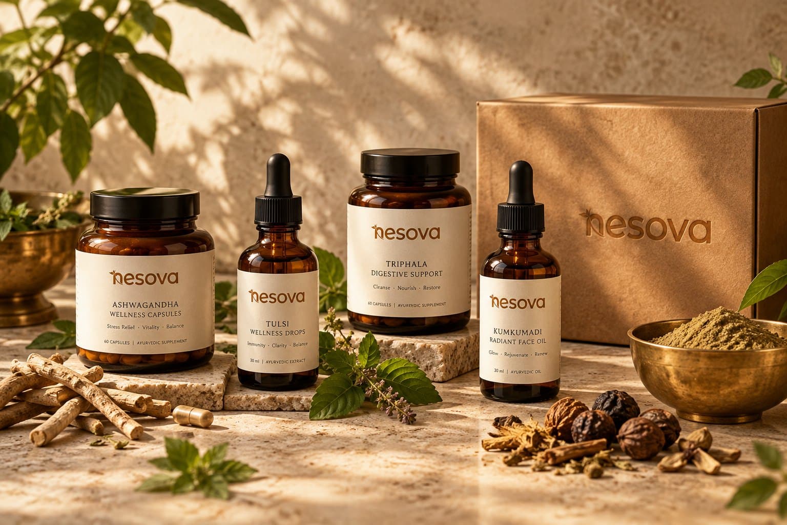
Ayurvedic supplements are a crowded, often loud category. Nesova wanted to stand apart with calm confidence: authentic formulations presented with the restraint and clarity of a modern wellness brand.
What we did
Our approach
- 01
Positioning: nurturing with nature
We framed Nesova as a return to balance that feels natural, not forced, which shaped the name story, tone of voice and every product description.
- 02
Packaging and identity
Amber jars, droppers and kraft boxes with a restrained palette and botanical cues, designed to look premium on a shelf and trustworthy in a thumbnail.
- 03
A website that explains, not shouts
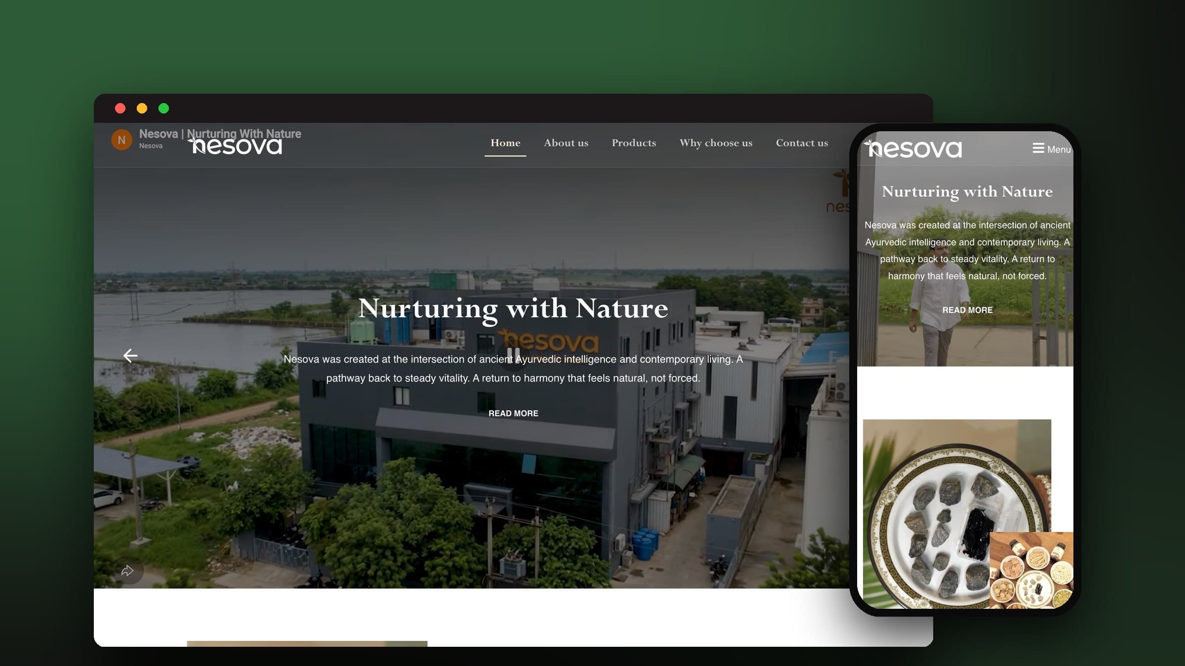
Each product, from ashwagandha to triphala, gets a clear page on traditional use and ingredients, with quality and sourcing explained up front.
- 04
Marketing from the same voice
Content and campaigns carry the same calm tone, so the brand feels consistent from social posts to the product page.
What we built
- Brand positioning & voice
- Logo & identity system
- Packaging design
- Product range pages
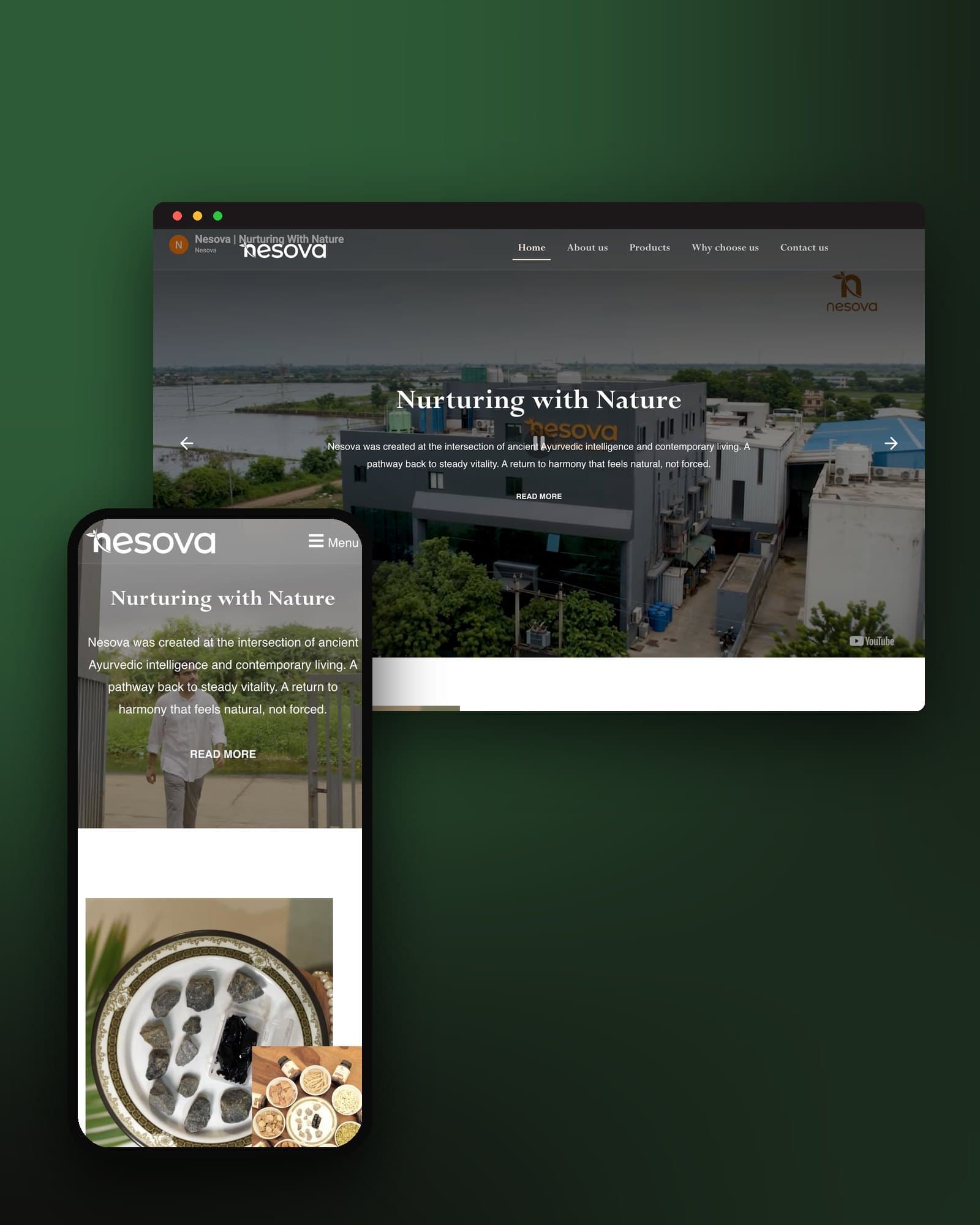
- Website development
- Content & marketing
Platform: WordPress · Responsive design · SEO content structure
Where it stands
Nesova launched with a cohesive identity, packaging and website covering its full range of tablets and capsules, and a voice that carries through its marketing.
Nesova in the wild
Building something similar?
Tell us what you are building. Our team will walk you through how we would approach it, and what we learned on projects like this one.